2013 NCAA SeasonAug 27, 2013 by The GymShark
Photographer's Spotlight: Alabama
Photographer's Spotlight: Alabama
Photographer's Spotlight: Alabama
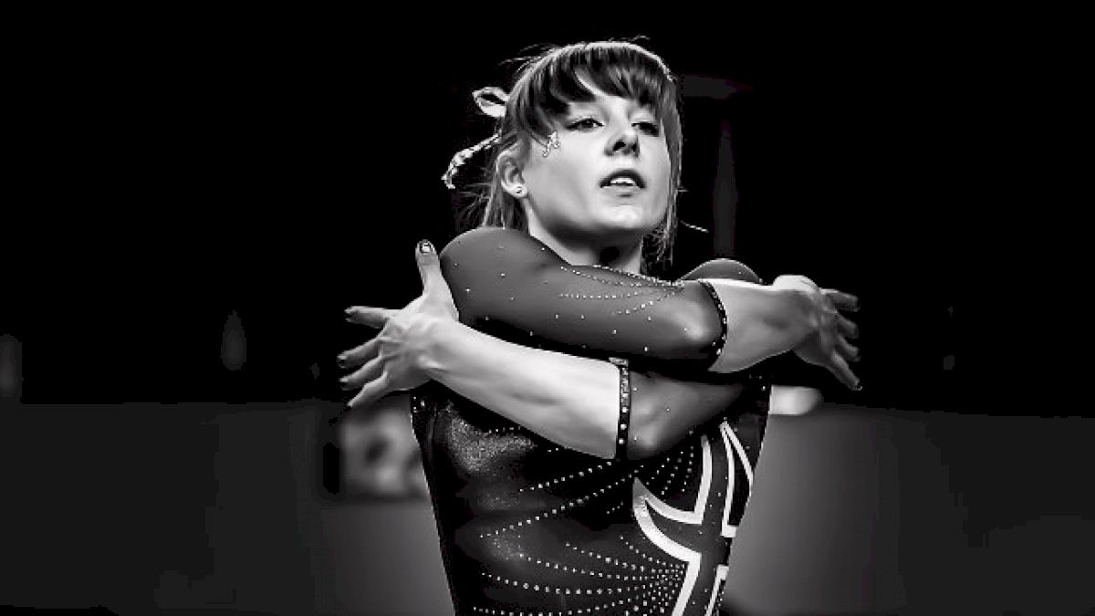
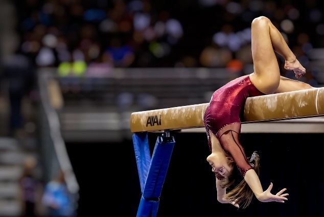

This installment of the Photographer’s Spotlight features the 2013 Alabama Crimson Tide whom finished in 3rd place at the NCAA Super-Six Finals.
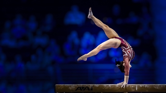
The opening photos feature the 2013 SEC Scholar-Athlete of the Year and Academic All-American, Kim Jacob.
The first photo (from the SEC Championships) features conventional color saturation with warm highlights that bring out beautiful flesh tones particularly in our gymnast’s legs and a pleasing natural hue in the balance beam.
Kim’s pose is beautiful from this angle and there is a pleasing depth-of-field ratio between the foreground and background. If you like this photo, you can thank the SEC’s media relations who, unlike the NCAA’s media relations at regionals & championships, allowed me to stand in the perfect spot where the light, the subject and background were in excellent balance.
The second photograph was inspired from the sometimes stark and minimalist nature of some fine art photography or silhouette-type magazine photo shoots of the late 1940’s and early 50’s. The monochrome pallet is a simple silver-gray with a subtle soft glow. I pulled the focus point to the right edge of the frame to create large negative space. The negative space combined with cropping a narrow pixel height versus wide pixel width creates the perfect look for this concept.
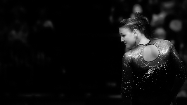
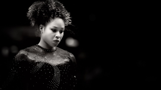
In building my 2013 Alabama photo collection, I thought it was important to create groups of images with contrasting styles or themes. One type of contrast I used in this collection was soft versus sharp edges.
The top image above features Lauren Beers and the bottom, Diandra Milliner. A lot of detail and sharp lines are visible in their leotards while their hair and faces are subtly doused in soft light.
To bring out more detail in the leotards, the magenta color mix was brought down which created a rich dark gray hue in their “pink meet” leos, while highlights and silver/white color were boosted to make the rhinestones/sequins sparkle.
Lauren and Diandra both look gorgeous and feminine in these poses, in contrast to the complicated gymnastics they are actually performing.
The other side of the coin from the approach of soft light is well-lit, sharp, hard edges.
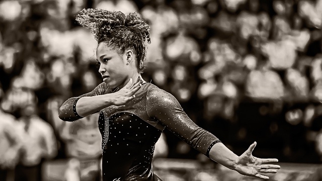
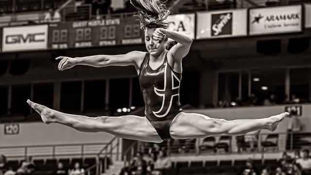
The top two photos of Diandra and Kim above, show hard edges achieved with high in-camera sharpening that brings out detail in their hair and flesh. Combined with a sepia monochrome pallet (with slight undertones of dark gold in Diandra’s photo), this look does a good job of freezing the action with clarity.
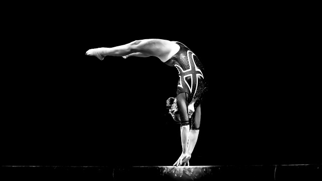
The third photo above features Ashley Priess and shows how well-defined edges are achieved with high contrast rather than with in-camera sharpening. High-contrast white highlights, which are slightly overdone, are effective in bringing out details such as the “A” in the leotard and the chalk prints on the beam.
This monochrome pallet features muted red HSL (Hue, Saturation, Luminance) which turns the crimson leotard into a charcoal/graphite gray.
Focused light (not soft light) combined with super underexposure of the remaining elements in the frame, creates a simple and beautiful composition which gets out of the way of Ashley’s elegant gymnastics.
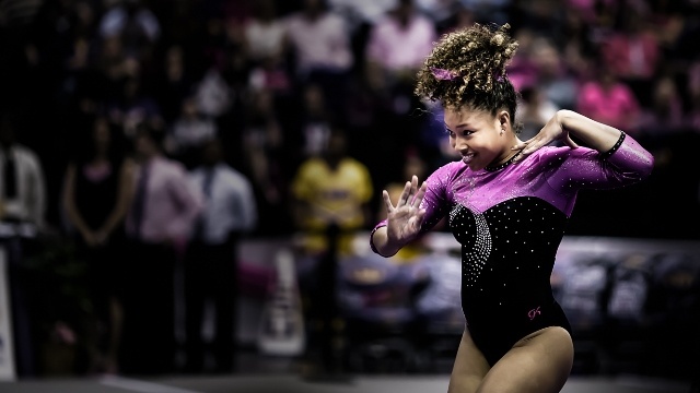
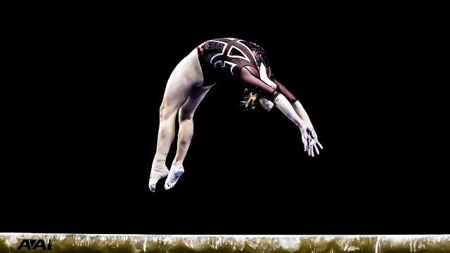


Another point of contrast in my Alabama collection was the occasional use of bleached-out and muted colors.
The four photos above, featuring Diandra, Ashley, Sarah DeMeo and Kim, are good examples of the various approaches I used, where in some cases I would mute categories of color, such as all warm tones, or mute mostly just the cool tones, and then add various filters to give subtle skylight or other washed-out light effects.
My favorite photo of this style is probably the picture of Kim. The muted blue of the NCAA banner she is standing in front of, combined with the muted metallic red in her leotard with the white sleeve, is a beautiful combination. Her excellent presentation of her floor choreography is icing on the cake.
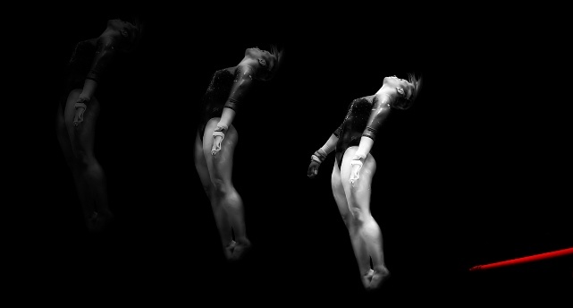
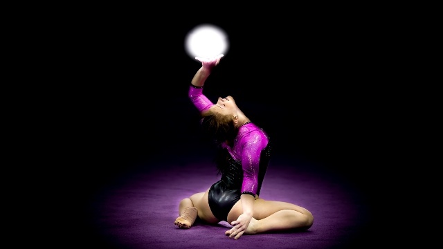

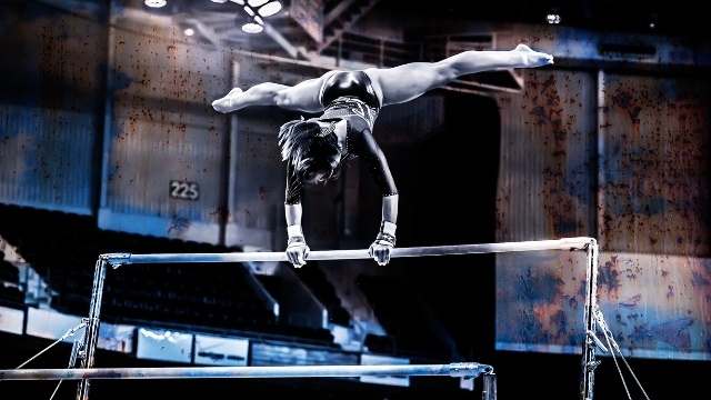
Some of my favorite images are ones that inspire me to creatively push the envelope of typical gymnastics photography, and give the audience something unexpected.
The five images above show differing concepts and thus different approaches of special effects.
The inspiration for the first image of Kaitlyn Clark was a sci-fi TV show involving time travel. The theme of “echoes of time” and multiple threads of timelines influenced the “echoed” images of Kaitlyn. I like that the image composition includes just the top bar of the UB, none of the cables or supports, and is drenched in red color.
I love the next picture of Sarah DeMeo. The purple circle around her comes from the purple floor at LSU. When I saw her hit this pose, I thought of an almost “other-worldly” rhythmic gymnastics pose, with Sarah holding a star or other celestial entity in her hand.
The third photo of Kim Jacob flying is pretty much self-explanatory. When I saw Kim flying into the camera frame at the perfect angle, I knew I was going to have to do something special with this photo. I took a picture of clouds from my front yard on an overcast day and simply blended it with the image of Kim.
The concepts behind the next two pictures of Kim and Sarah were very strange, surreal, and sci-fi inspired. If I told you what I was thinking, you would be convinced I’m from another galaxy.
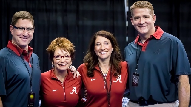
In closing, I’d like to thank the Alabama coaching staff for their generous and gracious access to photograph their team and I also thank them for posing for this photo. They are awesome, wonderful people and I wish them lots of luck in 2014, and of course, Roll Tide Roll!
You can view the photo album of my Alabama collection here on gymnastike at this link:
http://www.gymnastike.org/photoalbum/449172-Alabama-Gymnastics-2013
The GymShark on Facebook:
https://www.facebook.com/pages/The-Gymshark/214755135342483
The GymShark on Twitter
https://twitter.com/TheGymShark
The GymShark's website:
http://gymsharkphoto.zenfolio.com/